top of page
Vitto.ai
Helping Desk Workers Build Healthier Break Habits
.png)
Role
UX/UI Design
User Research
Prototyping
Usability Testing
Tools
Google Forms
Google Meet
Figma
Maze
Timeline
February 2024 - June 2024
Overview
Summary
This project focuses on the interface of video-based web software that promotes good health habits by encouraging users to take a break from their desks to exercise or stay hydrated. User surveys, interviews, a journey map, and competitive analysis had been conducted to acquire a deeper outlook surrounding the health and fitness sphere. The outcomes were visualizing an interactive dashboard that allows users to set an alarm for breaks, employ an AI assistant, and write journal entries for reflecting on the progress made. Necessary skills and knowledge were gained from the project, such as creating components and applying online tools to manufacture reliable prototypes. To accelerate production of the application's research and development, I collaborated with 3 other UX designers and 1 team leader.
Problem
➤ Users spend an excessive amount of time seated in front of their computers due to online work and study.
➤ When individuals sit for long periods, they can have many issues, such as back and neck pain, depleted energy levels, and high stress.
➤ As this type of problem emerges, a majority of the population could negatively impact the healthcare system.
Solution
✔ A video-based application that supports effective health habits via the mirroring concept, a reliable and effective method that encourages users to replicate exercises.
✔ Visual pop-ups will appear to remind the user when it is time to take a break from their computer to exercise, grab a snack, or take their medication.
✔ After viewing a short clip of exercises such as stretching and yoga, users gain the motivation to copy the movements, significantly improving their overall health.
Research
Methodologies
Tasks would be organized and completed through Trello to maintain communication within the team and the progress of the project. We began the project in Figma to understand the conceptual aspect of the Vitto.ai web extension. This would help us identify what users want from a break/exercise reminder software add-on. Two methods would be utilized when acquiring user data, which include surveys (quantitative) and interviews (qualitative).

Number of survey respondents: 17

Number of interviewees: 8
*Not statistically representative
Survey — Quantitative Data


Interviews — Qualitative Data
Our team's focus shifted over to the user interviews, where more in-depth questions could take place. Our aim was to gather additional details on the user's lifestyle and the way they keep up with their health progress through a questionnaire.
The Fathom software, an AI software that automatically writes down notes, was employed in case we needed to backtrack and transcribe the information from the interviewee's answers. Obtaining detail-oriented answers from interviewees would be moderately challenging since the questions would have to be phrased where they did not sound redundant or repetitive.
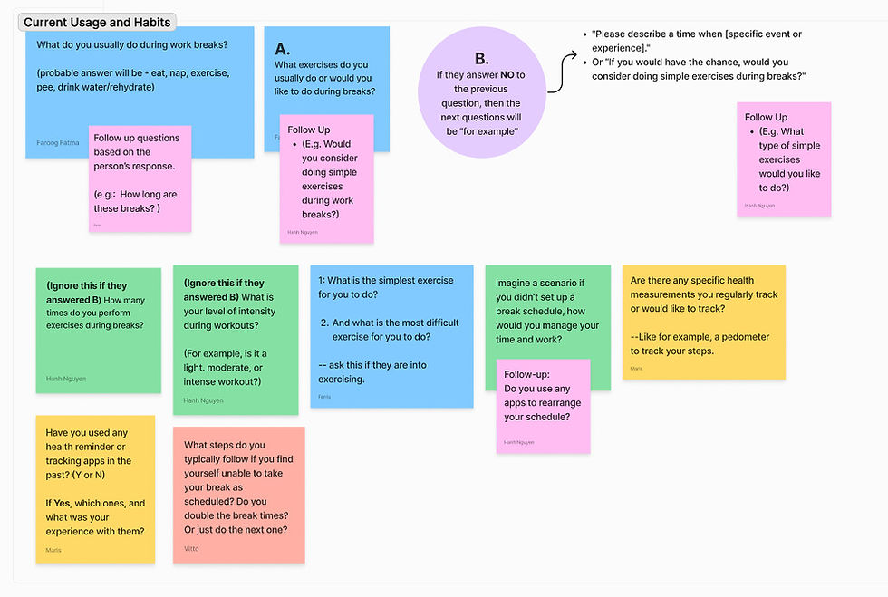

Upon completing the interviews, the responses from the interviewees had been transcribed so that they could be analyzed for when we integrate specific and useful features into the application's systemic framework. The team's research findings revealed crucial points relating to the user's lifestyle and preferences for working towards positive exercise goals.
Data Insights
➤ The irregular and long work hours spent on the laptop could lead to issues such as eye strain, fatigue, and musculoskeletal discomfort.
➤ The challenges faced at work vary depending on the nature of the job and individual circumstances.
➤ As this type of problem emerges, a majority of the population could negatively impact the healthcare system.
➤ Individuals find value in establishing and adhering to consistent daily schedules to enhance productivity and reduce distractions.
➤ Many respondents use their breaks to catch up on social media or communicate with friends.
➤ Some individuals prefer light exercises such as walking, stretching, or meditation during their breaks.
➤ A few respondents track specific metrics such as heart rate and glucose levels, while others focus on more general measurements like steps, standing hours, and calories burned using devices like Apple Watch or fitness apps.
Oh yeah, yeah, I think it's more doable for me if I do a simple exercise because going to the gym sometimes is really time consuming as well."
I normally, because I'm using Apple Watch, so I normally track my steps and also like standing hours, moving calories staff, the options they have for Apple Watch... actually, probably even more than once a day, two, three times a day."
Applying for positions is kind of a challenging thing. I also try to study up on software development so it's a newer field for me so it's quite challenging to kind of pace myself."
Journey Map
The journey map that we created does not showcase any particular personas since the concept of the Vitto web extension would target a huge demographic of users by having a single fictional entity. As we analyzed the data that we gathered, we noticed users all had the same goal, which is to find a way to deal with their eye strain, occasional mild headaches, or other types of issues when sitting at their desks for a long time.
Vitto.ai acts as a tool that users can engage with in order to enhance their overall physical, mental, and emotional health. The conclusion of the users' journey has made them more relieved and hopeful about their condition. Feedback revolving around negative outcomes is taken into consideration to ensure that the needs of the users are fulfilled.

Competitive Analysis
To gain an in-depth perspective of what our users want, we examined the strengths of health management applications and analyzed the concepts that could be improved. The team collaborated on gathering informational data on the distinctive attributes that are seen in our competitors' products, such as the reward and punish system, an in-app library of resources, and many customizable options to suit users' needs. We would identify negative aspects of health/break reminder software, allowing us to devise solutions that successfully engage users into performing exercise and spend less time on their computer.


Prototyping
Simple navigation system for locating specific pages
Low-fidelity Wireframes


Calendar feature allows users to access journal entries quickly
Submenu for navigation elements to enhance efficiency
AI Chatbot implemented for users who need help and support
Library provides seamless interface for choosing an exercise
Usability Test Results
Task: locate the Finger Lift exercise through the exercise library.
Number of participants: 3

66.7% Direct Success
More than half of the participants successfully found the "Finger Lift Exercise."
39.3% Misclick rate
More than half of the participants had not clicked on the right buttons.
23.2s Avg. duration
Total seconds to complete the task. In this case, it took a long time to locate the exercise.
High-fidelity Prototype
After reviewing the results of the usability test, the team applied the necessary alterations to the interface, strengthening the visual and functional aspects surrounding the software's layouts. A distinct set of typography, iconography, colors, and information architecture were considered in the design of how users could traverse the web application with ease. Further, an AI chatbot concept had been included if users required assistance on how to utilize the application's features effectively. Although the project was still in development, our team laid out an exceptional foundation for other designers to continue the work that had been finished.
.png)
Home
.png)
Exercise Library

Journals
Results
Vitto.ai had given the team and me in-depth insights into what features users favor most when using health and fitness applications within their lives. The interactive design serves as a foundation for the next steps in designing and developing the project for users of all types. Moreover, I acquired hands-on experience with gaining user insights, analyzing and synthesizing data, applying critical thinking skills to the interface design, and utilizing team-based strategies for pushing the project forward. Furthermore, I became knowledgeable in employing online tools such as Figma, Google Forms, Fathom AI Notetaker, and Maze, which gave me a deeper comprehension of user behavior and psychology. As more problems emerge in the future, I hope to utilize my capabilities within the field of human-computer interaction to provide effective solutions for users in future endeavors.
.png)
bottom of page